Helon Lee
A Design System
That Builds Trust


Regardless of the company size, I believe that when we can communicate consistently across all touch points, brand perception will eventually improve—leading to a higher level of trust.
Context
As the first UX Designer hire at ID.me during its formative growth phase, I undertook the challenge of developing a Brand Design System. This system was intended to establish a foundation for creating a consistent and unified product experience.
This strategic initiative proved to be instrumental in ID.me's ambition to emerge as the premier Digital Identity Provider in the nation.
Objective
To unify our brand strategy and effectively communicate our value to both prospects and existing users.
DURATION
10 Weeks (Initially); Ongoing (Maintenance)
SKILLS
UX Research
UX/UI Design
Creative Direction
Full-Fidelity Designs
Confluence

01 /Discovery & Defining Our Goals
Understanding Team Dynamics and Defining Design Needs
To align better with team needs, I organized a focus group with representatives from Marketing, Engineering, and Product Management. This session highlighted critical issues that needed attention: inconsistent Call-To-Action (CTA) button styles and multiple shades of blue used across our products.
If these issues aren't addressed, the risks include:
-
User Confusion: Varied button styles and inconsistent blue colors can lead to unclear navigation and interactions.
-
Brand Cohesion Issues: Disparate visual elements can undermine the overall consistency and professionalism of our products.
Bridging the Gap: Fixing Visual and Functional Issues

Addressing these issues is vital to avoid damaging user trust and brand perception.
The audit assessment involved reviewing all ID.me user interfaces to identify design inconsistencies. We cataloged different Call-To-Action (CTA) button styles and various shades of blue used across products, analyzed their differences, and assessed their impact on user experience.
Here's what we found:


In Total, We Identified:
8
Variations of a similar ‘blue’ used for text and button styles.

5
Different ‘primary’ call-to-action button styles.

Defining Opportunities for Growth and Efficiency
Design Consistency
Our teams struggled to maintain a consistent brand identity, leading to a fragmented user experience. Standardizing our design language will create a cohesive and trustworthy appearance across all touchpoints.
Scalable Design for Growth
As ID.me grows rapidly, our current design practices need to evolve. Implementing a scalable and standardized design approach will improve efficiency and keep up with the company's expansion.
Building Trust Through Design
For ID.me, establishing user trust is crucial. A unified design strategy will enhance our ability to communicate reliability and security, reinforcing our brand’s core values effectively.
Efficient Development
By creating clear design guidelines, we can eliminate guesswork and streamline the development process. This will accelerate project timelines and reduce inconsistencies, leading to faster and more efficient product updates.
As our business expands into new industries and prepares to launch new products and services in the next six months, establishing standardized brand guidelines will benefit everyone involved.
03 /
Design, Iteration, & Testing
Collaboration with Cross-functional Teams
To ensure that the brand design system aligns with the company’s overarching goals, I worked closely with key stakeholders to gather valuable insights from diverse perspectives, fostering a comprehensive understanding of their specific needs.
Mind the Format—Delivery Method Matters.
To ensure that brand building guidelines can reach the intended audience and build trust with our users, I conducted a thorough survey and customizing brand-building documents based on the preferences of diverse audiences.
Tailoring the content to suit each team’s context and presenting it in familiar and accessible formats led to increased engagement and improved communication across the organization and with clients.

Internal Audiences
1) Engineers (StoryBook)
2) Product Owner (Confluence)
3) Product Designers (Figma)
4) Marketing Department (PDF, Google Drive)
External Audiences
1) Clients/Customers (Google Slides)
2) Partners (Our Website)
3) Vendors (Our Website / PDF)

Step 1: Establishing Our Design Principles
Through in-depth research and thorough design audits, we crafted a comprehensive set of practical design principles, encompassing key elements such as colors, typography, and spacing rules for layouts. These principles serve as a guiding framework and has the ability to influence all design decisions moving forward.

Color
We simplified our color palette by reducing eleven shades of blue to four distinct, refined hues, achieving visual consistency. This approach not only enhanced the user experience but also fostered a sense of reliability and trust.
The colors now serve specific roles:
Ink: Used for text elements
Sapphire Blue: Designated for primary call-to-action buttons
Emerald Green: Used as an accent color
Citron: Applied for emphasis

Typography
By simplifying text styles, we created a clear hierarchy that improves readability and user comprehension.
The new modular system ensures consistent and efficient typography, maintaining a unified visual identity across all design elements and layouts.
Step 2: In-Depth Analysis of Our Colors & Typography


Our efforts resulted in a standardized Call-to-Action button design, achieving greater brand consistency and flexibility. By streamlining our color palette and simplifying typography, we’ve created a coherent visual language that enhances user experience and maintains a unified look across the platform.

Spacing–Rules.
Having optimal spacing rules in UI design is crucial as it enhances visual clarity and user experience by ensuring a harmonious and balanced arrangement of elements, leading to a more intuitive and engaging interface. Consistency in spacing cultivates a sense of familiarity and professionalism, strengthening the brand identity and reinforcing user trust.

Our Multi-Factor Authentication screen are used by millions of users to protect their ID.me accounts.
It serves as a crucial layer of security, ensuring the safety and integrity of their personal information.
Step 3: Testing and Iterating on UI Components
Building upon the design principles, we meticulously crafted a library of reusable UI components. To ensure their viability, we thoroughly tested them and refined each element through multiple design iterations. Ultimately, once everything satisfy both Engineering and Design, it was time for the handoff.


These components served as essential building blocks, empowering designers and developers to swiftly create cohesive and trustworthy user experiences. By using this library, we achieved consistency across our products and improved the overall efficiency of the design and development process.
Examples of ID.me Products Before & After Implementing Our Design System
Tap or Hover to Reveal the Before and After Design
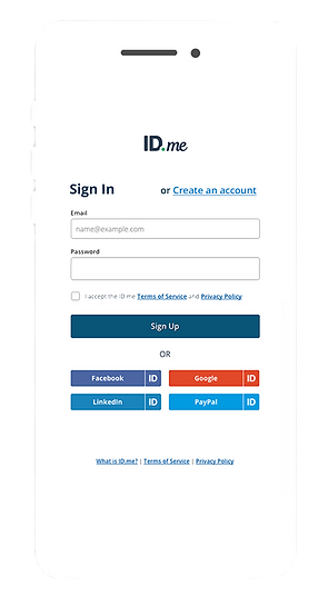
Sign In

Shop.ID.me


ID.me Homepage


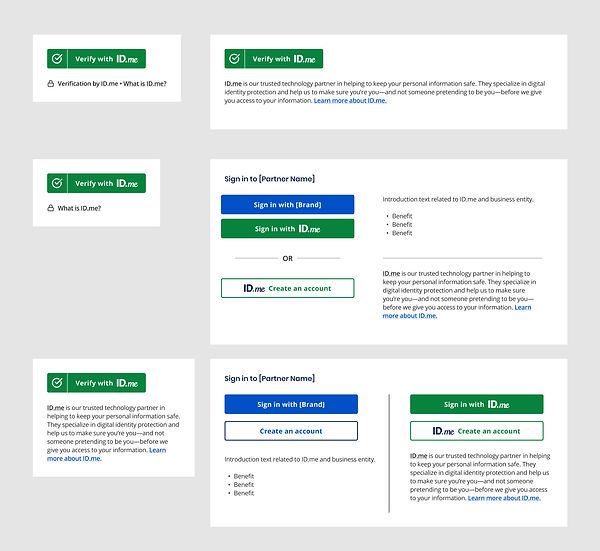
The Iconic ID.me Button
Receives a Brand Refresh
Our goal is to establish clear guidelines for its implementation to meet 508 Compliance Standards, ensuring consistency across all experiences.
This was a crucial step as we aspire for the button to achieve a similar level of ubiquity as the ‘PayPal button,’ reaching universal recognition.
View the ID.me Brand Button Usage Guidelines here.

Button Usage Guidelines
We have curated various button styles, providing control and customization options for our merchant partners to choose from, ensuring a perfect fit for their implementation.
ID.me Green Button placement in vertical and horizontal orientations

Partners can choose from rectangle with rounded corners or 'pill shape' style buttons to suit their needs
Results & Impact
Establishing Brand Design Guidelines is the first step to building a Design System. As the company grows, we aim to involve domain owners in using and shaping these guidelines to maintain or augment brand expression.
For now, we are thrilled by the positive impact its adoption by Product, Engineering, and Marketing Teams has brought to ID.me and its users.
👍 Cross-Functional Team Synergy
Having a design pattern guideline means we have taken the guesswork out of the equation. Developers can now focus on building and shipping rather than interpreting and waiting for approval. Designers and Product Managers can spend more time planning, advising and approving designs before launch.
👀 Brand Recognition
The consistent visual identity of new product experiences enhances brand recognition for ID.me, empowering its marketing efforts to effectively communicate the company's values, messaging, and offerings. This unified brand presence instill trust and familiarity with customers, making ID.me easily recognizable and memorable in the market as it continues to grow and expand its services.
❤️ Universal Adoption
Designers have the flexibility to develop new brand style guidelines from the established system, encouraging divergent creative exploration while maintaining brand coherence and recognition. This approach ensures that ID.me's brand remains relevant and captivating to its audience, fostering a lasting connection and trust.